-
E-Commerce
12 Steps To Remove Distractions From E-commerce Checkout Pages
December 17, 2013 — By Brain Technosys
The checkout – it’s that all-important step in your site’s shopping cycle that can make or break the deal for you. Of course, you want to ensure that your checkout process is as smooth as marble. You don’t want any hiccups at this stage, and if there are any, you want to get rid of them. Here is how.
1. Clean Out Unnecessary Graphics
Keep all your high-resolution product images and other graphics for your product pages and landing pages. Your shopping cart checkout area should be clean and relatively free of graphics. So if you have any blinking icons or clever-looking 3D animations in your checkout procedure get rid of them. They only divert your customer.
2. Avoid Unnecessary Product Recommendations
Cross-selling and up-selling are absolutely necessary, but not during checkout. If your code is suggesting recommended products at the checkout phase, it’s time to clean it up. Product recommendations should appear when customer is still shopping, and not after the “Buy Now” button is clicked.
3. Be Transparent About Hidden Charges Beforehand
Hidden shipping charges, taxes and levies that suddenly become visible at the final checkout phase can be really distracting. They tend to shock the consumers, and get the customer to start thinking about cart abandonment. Be transparent right at the beginning, by letting the customer know how much your shipping charges are.
4. Don’t Present Last-minute Offers
Once your customer has selected a product to include into his or her shopping cart, it’s done. You don’t want to display last-minute offers on that product. Be especially careful not to lay any last-minute temptations at the customer’s door, especially after they click the Buy Now icon.
5. Clean Up Unnecessary Navigation
Make sure there are no unnecessary links anywhere in the shopping cart. Other than the various policies such as Privacy, Shipping, Returns and General Terms, no other links should be present. You don’t want the customer to visit a different page, site or Ad and forget to check out the items in the shopping cart.
6. Don’t Allow Any Ads
Even if you claim that Ads are unavoidable, remember, flashing banners do very little to help customers focus. It’s ok, to some extent, if your Ads turn up on your Home page or Product page. Keep your shopping cart and most especially the checkout page free of Ads in any format.
7. Display The Coupon Field Selectively
If you’re issuing coupons, display the coupon field selectively and privately based on the customer’s login. By displaying the coupon code box only to select traffic, you can prevent other shoppers from getting distracted. If this is not possible, try to hide the box creatively from other shoppers.
8. Isolate Checkout
To prevent distractions of all kinds, it’s best to isolate checkout overall. People tend to be curious, and anything catchy will be investigated by bored shoppers. Just make sure that there are no links to your site’s other pages on the checkout pages. It should be just checkout, plain and simple.
9. Minimize checkout steps
Did you know that 10% of all shopping cart abandonments are due to lengthy checkout processes?Don’t barrage your customers with forms, questions and products they don’t care about. Stick to a maximum of 3 steps for the entire checkout process.
10. Ask Only For Relevant Information
Checkout forms – necessary and unavoidable but definitely possible to streamline. What exactly do you want to know about the customer in order to process his or her order? Your customer’s name, address, payment details? Stick only to that. Asking too many questions only irritates your customers and gives them a darn good reason to hit the exit button.
11. Avoid Unnecessary Popups
Once the checkout is complete and payment is made, you’re free to follow up with surveys and feedback forms. Just don’t present an annoying survey form during checkout. There’s no need to know what your customer thinks about your site at this point. All you want is for the customer to checkout and come back to your site for more shopping.
12. Increase Processing Speed
A fast checkout process really impresses customers, so speed it up. For those customers who want to get out quickly, offer an Express Checkout option. Test the checkout and payment processing speed till you’re satisfied. When the process is really quick, there’s no time for getting distracted.
Author Bio: Masroor Ahmed is a conversion optimization analyst from Invesp and has worked for several top companies. He writes many insightful articles on conversion optimization.
Recent Posts


Categories
- .NET development
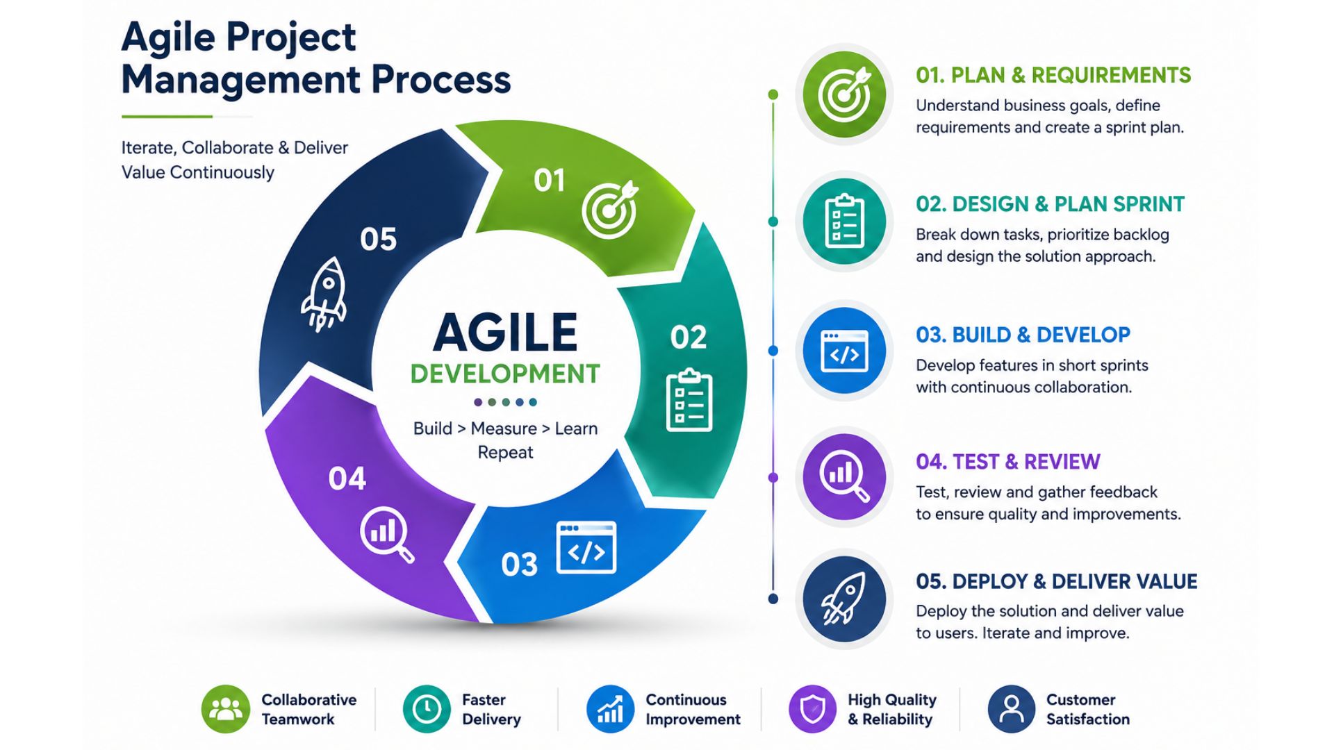
- Agile Project Management
- android app development
- Angular Developer
- Apps Development
- Bing Webmasters
- Blog Marketing
- Cloud Services
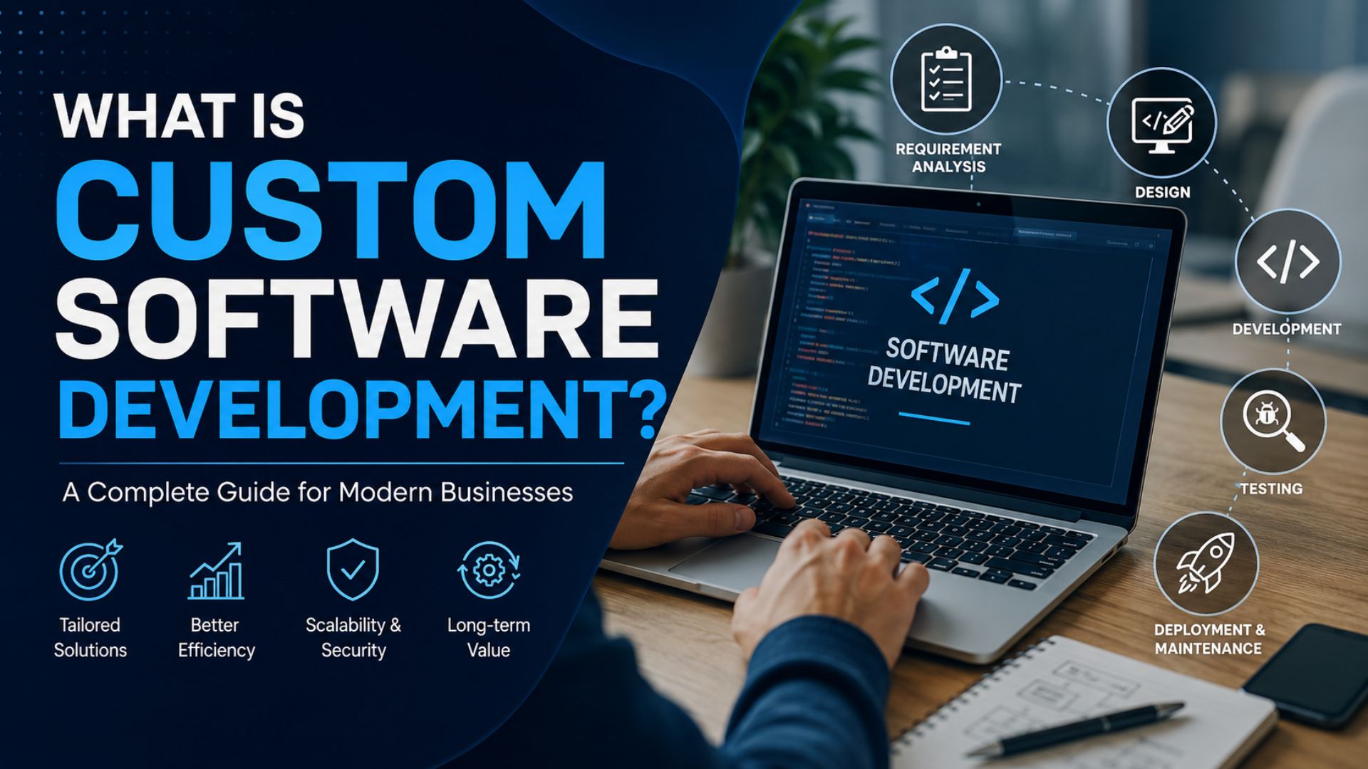
- Custom Software Development
- Digital Marketing
- E-Commerce
- Flutter App Development
- Google Adwords
- google map
- Google Update
- Google Webmasters
- HTML
- internet marketing
- Ios App Development
- iphone app development
- Local SEO
- magento development
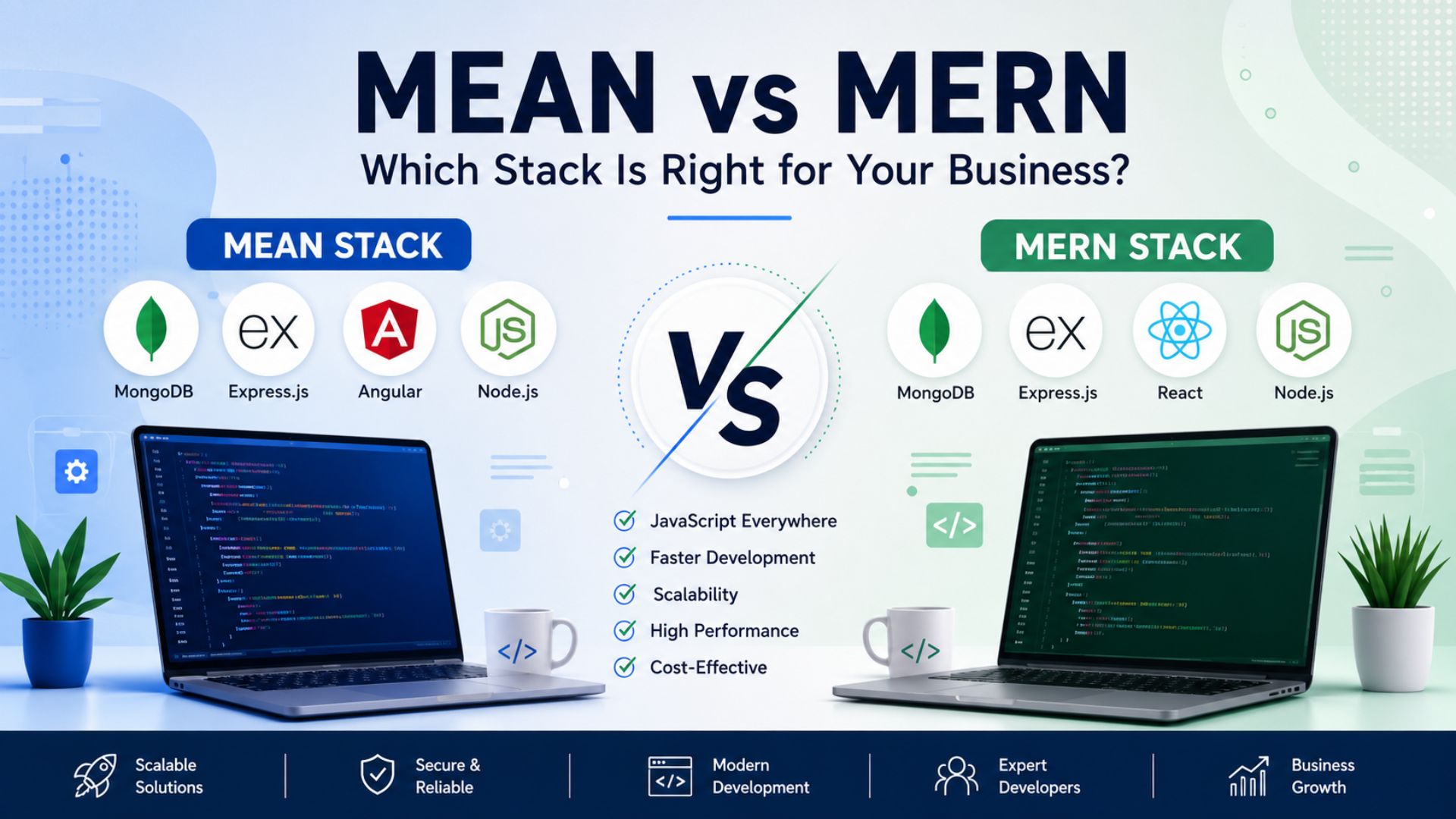
- MEAN vs MERN Stack Development
- mobile app development
- Mobile Update
- News & Events
- PPC
- Search Engine Optimization
- Seo
- Social Media Marketing
- Tech
- Uncategorized
- Web Design
- Web Development
- Web Hosting
- WooCommerce Development
